about
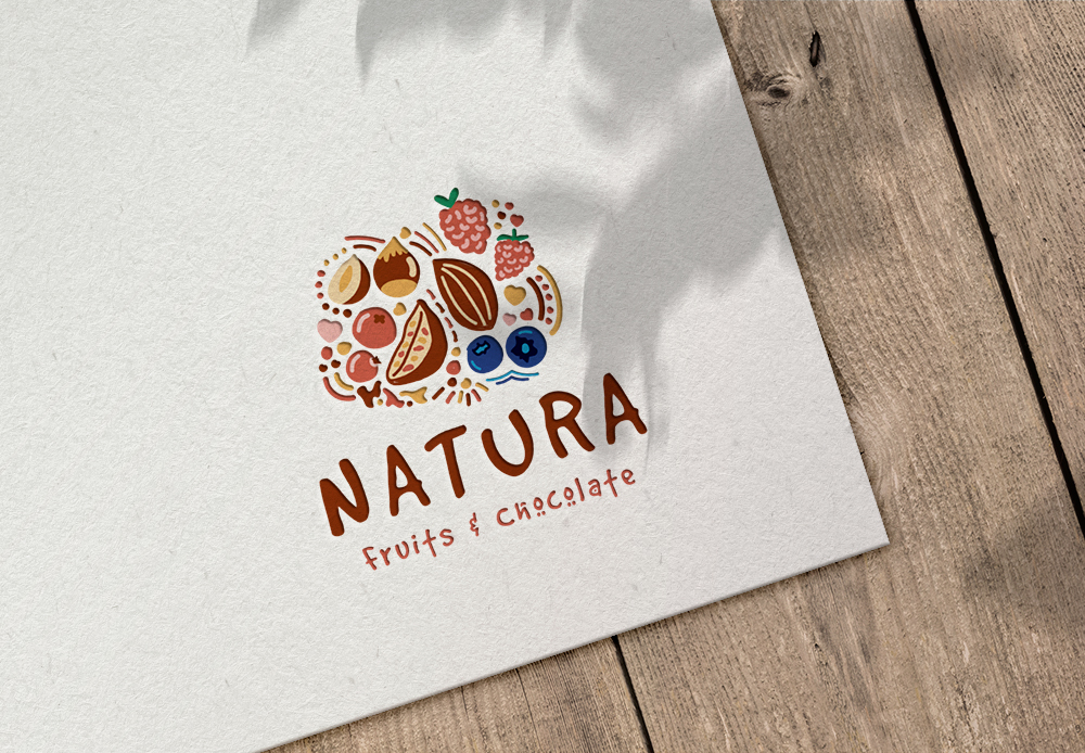
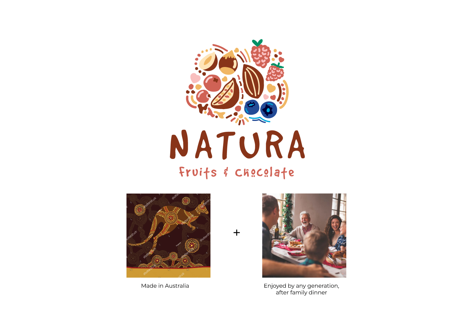
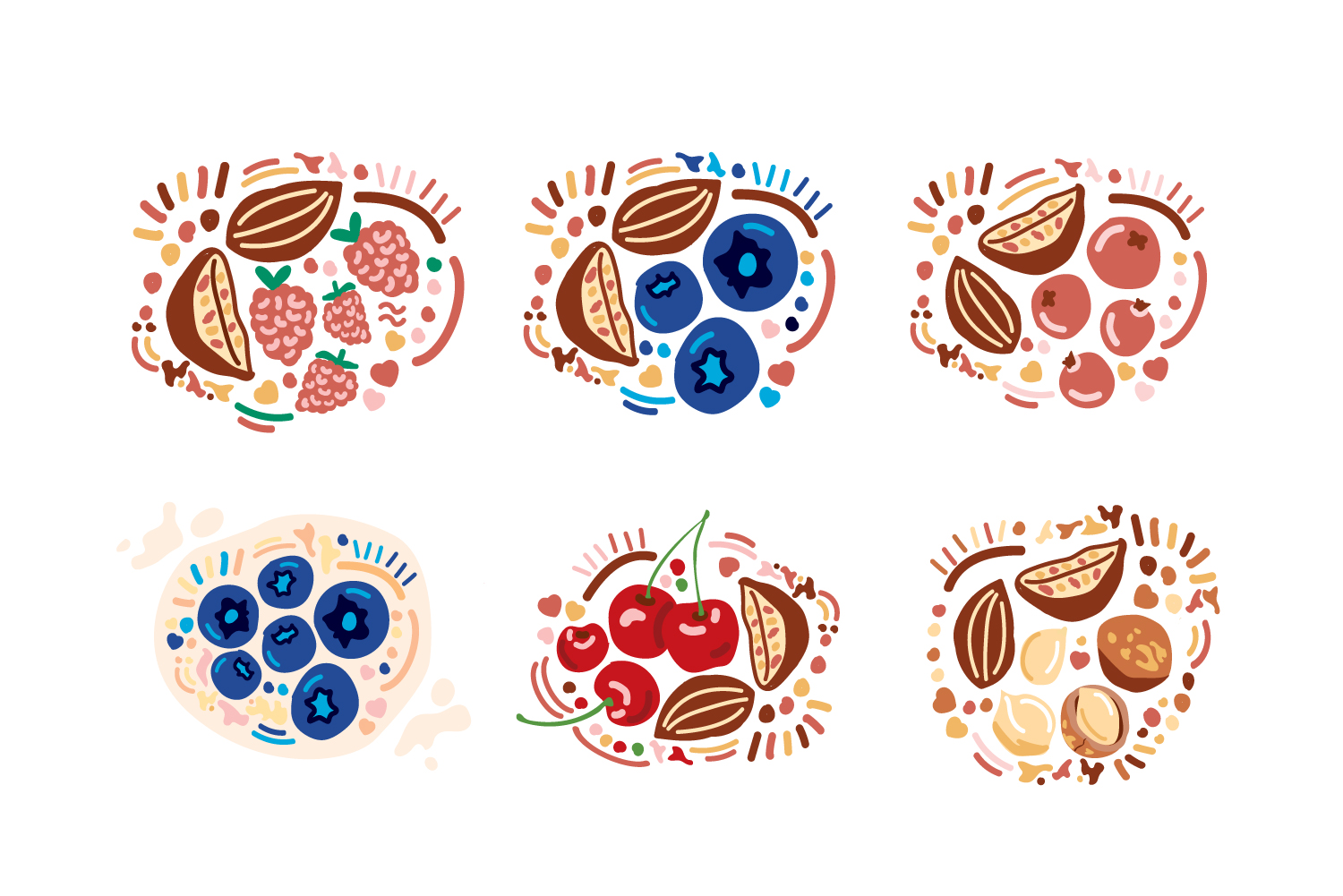
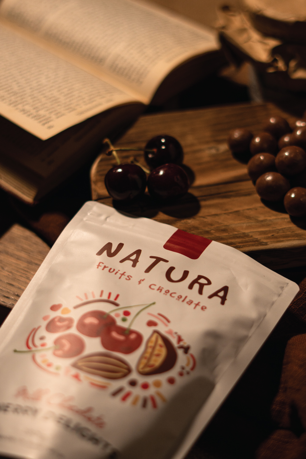
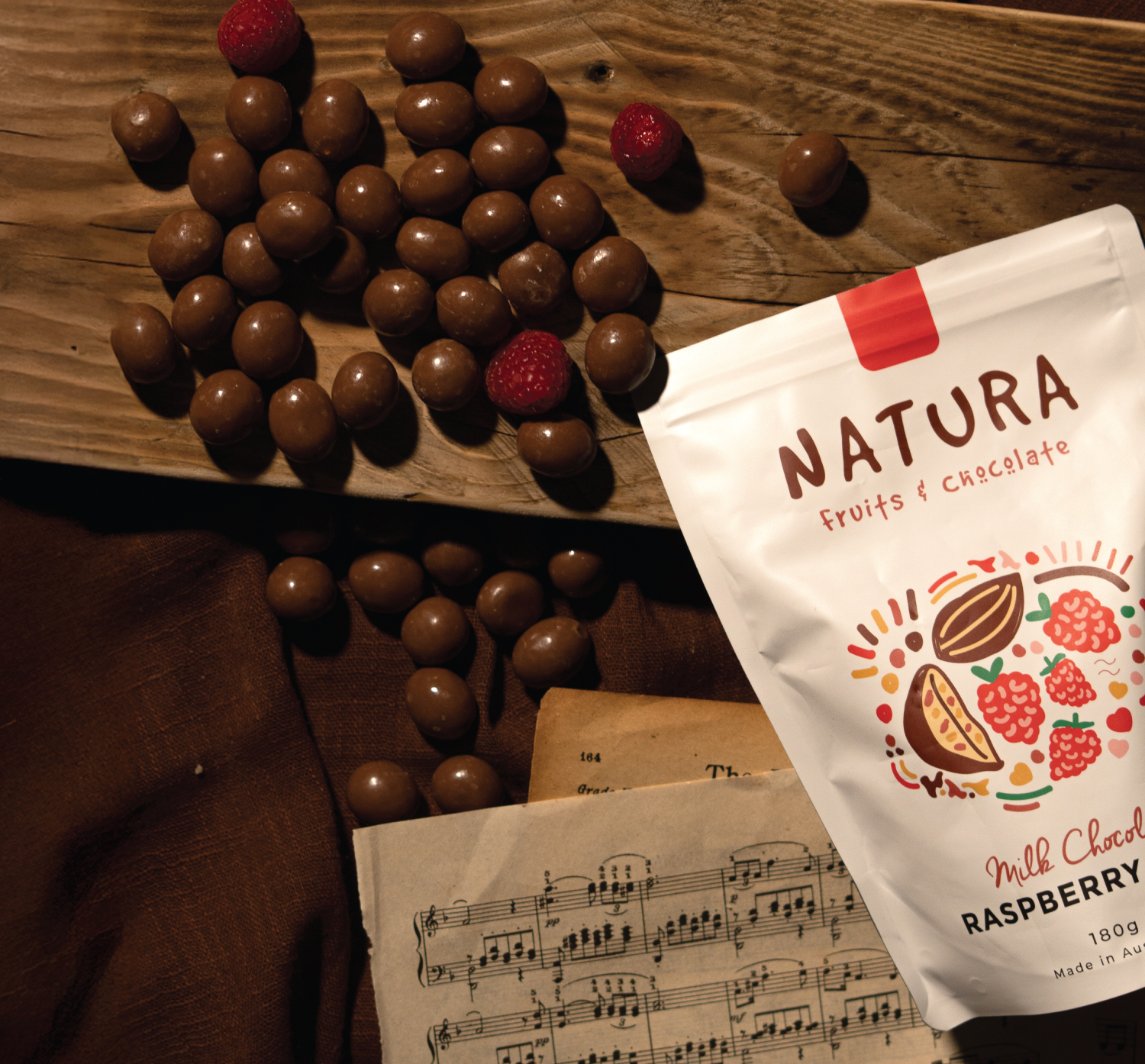
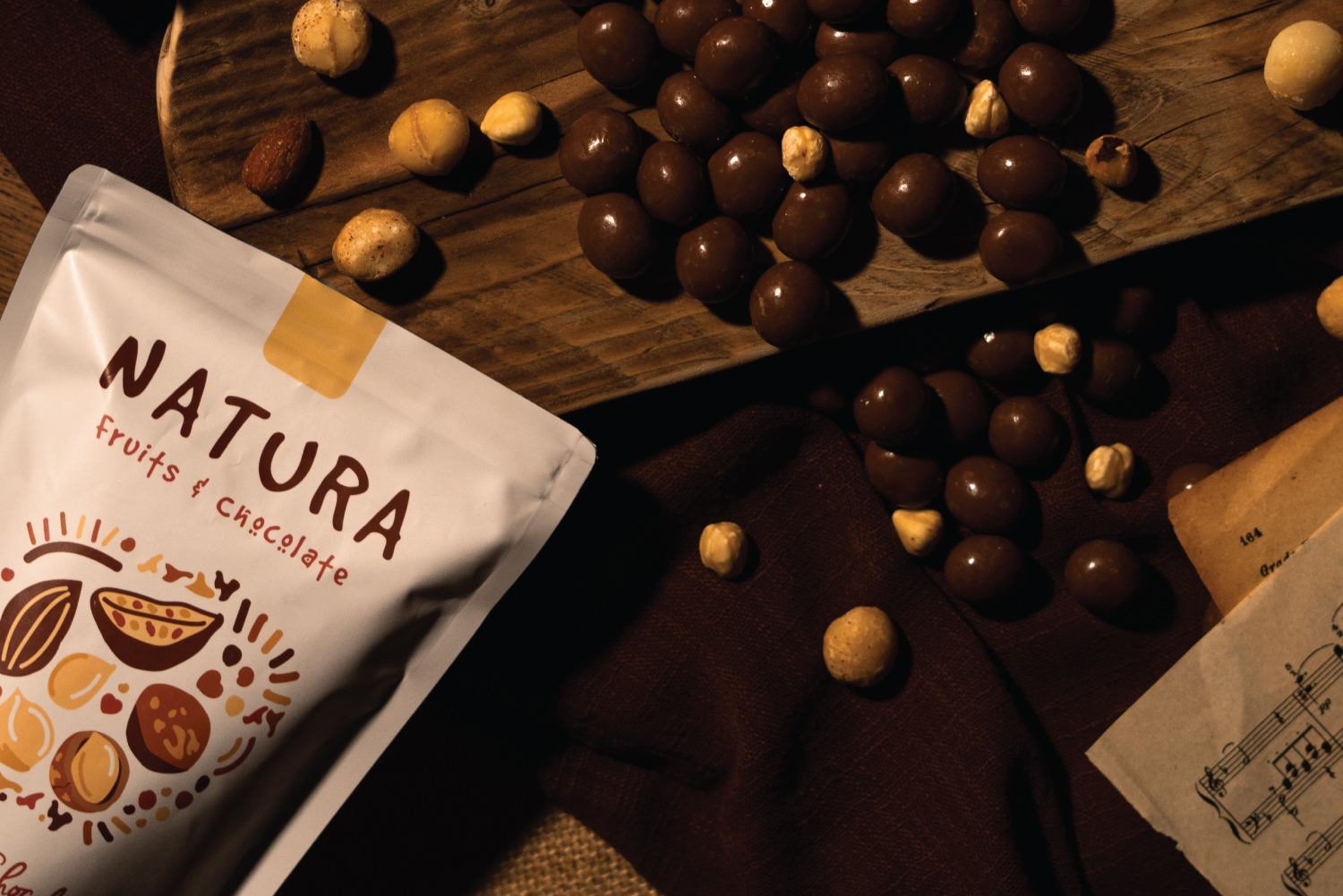
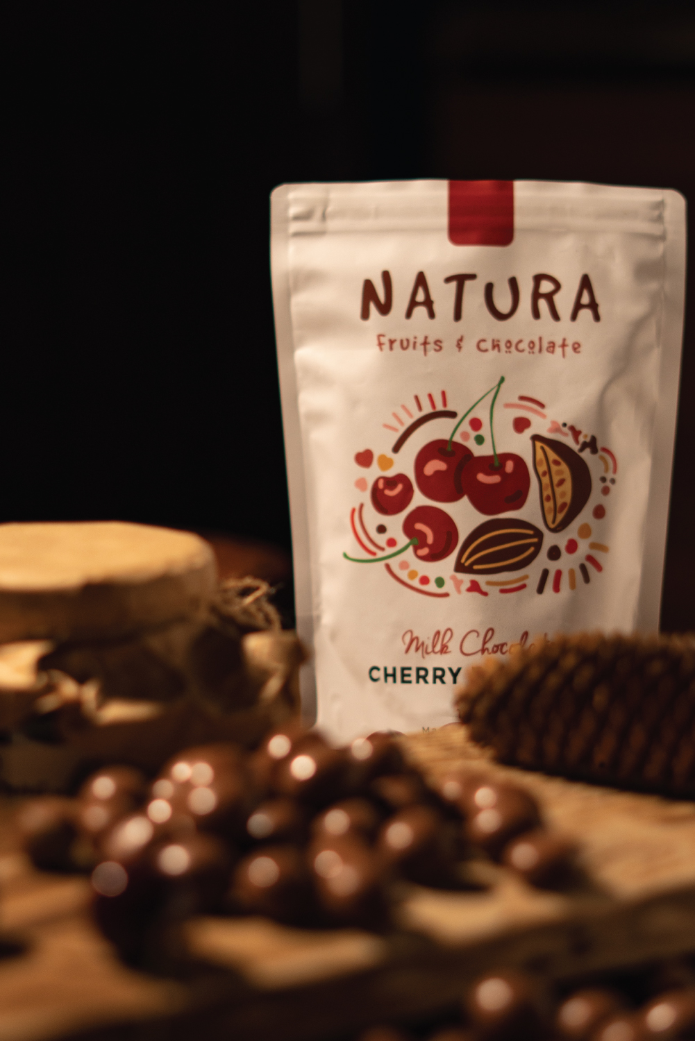
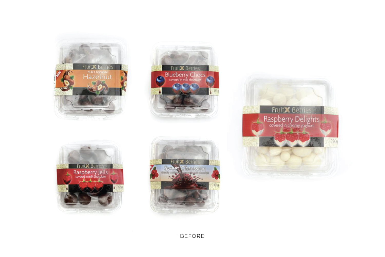
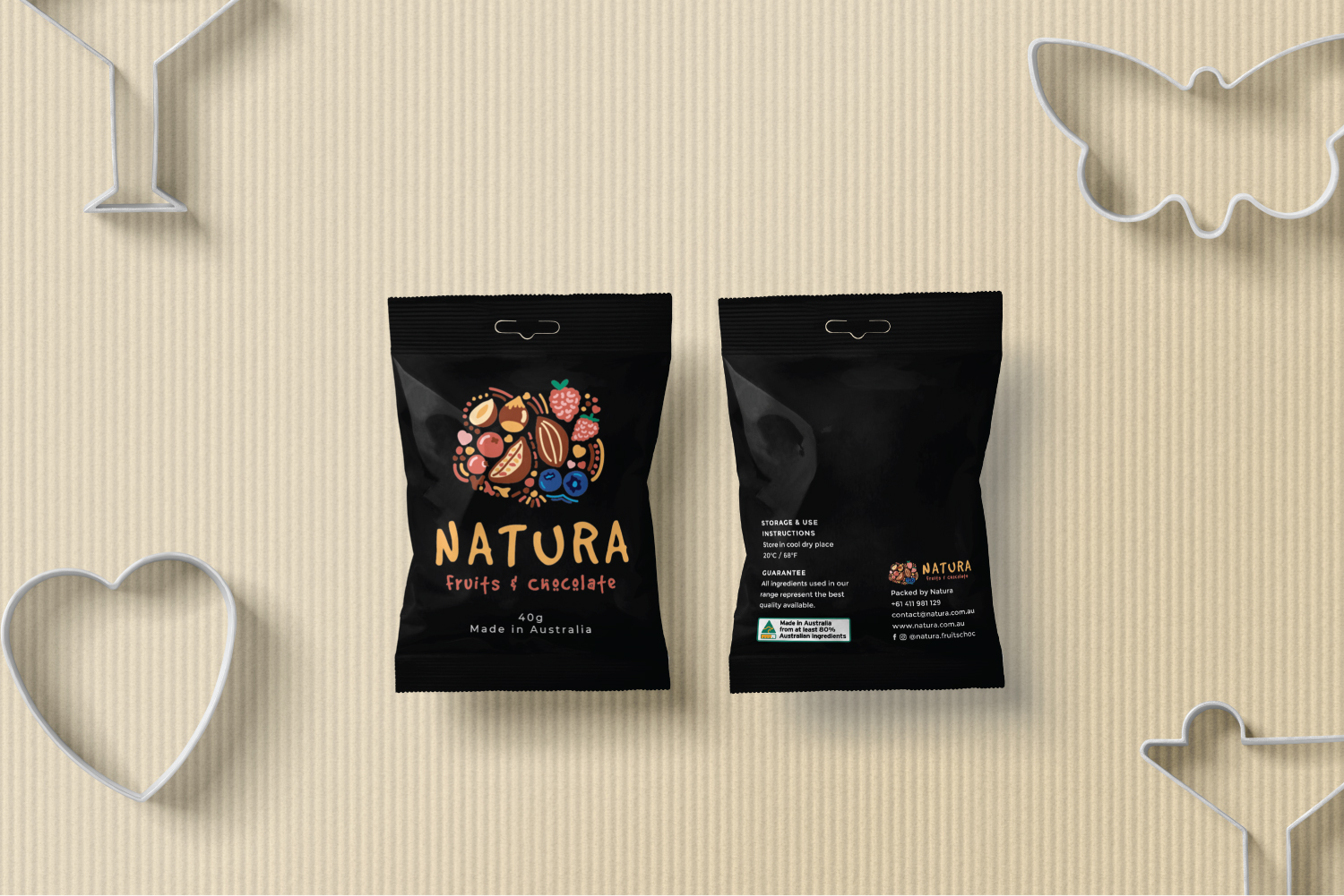
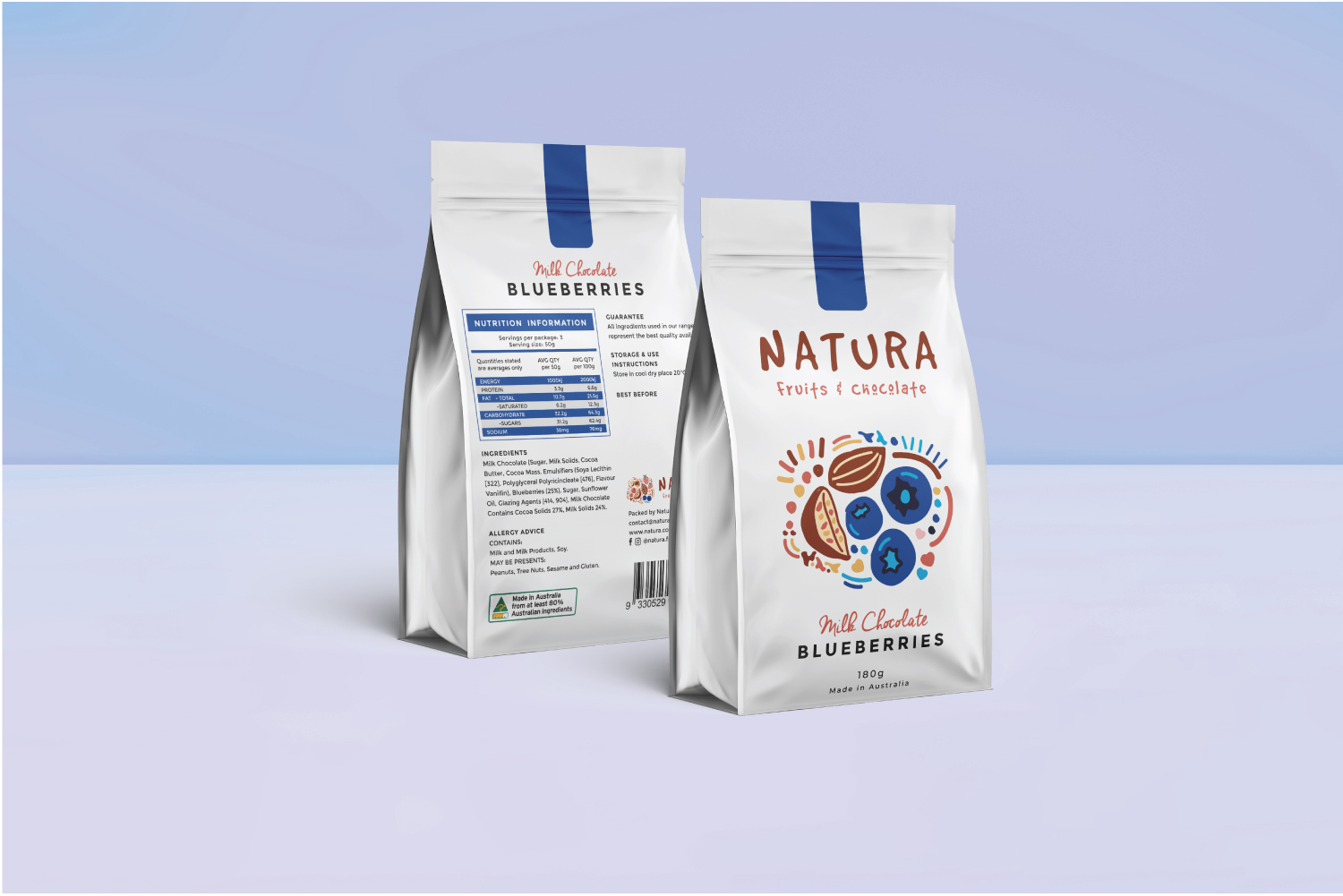
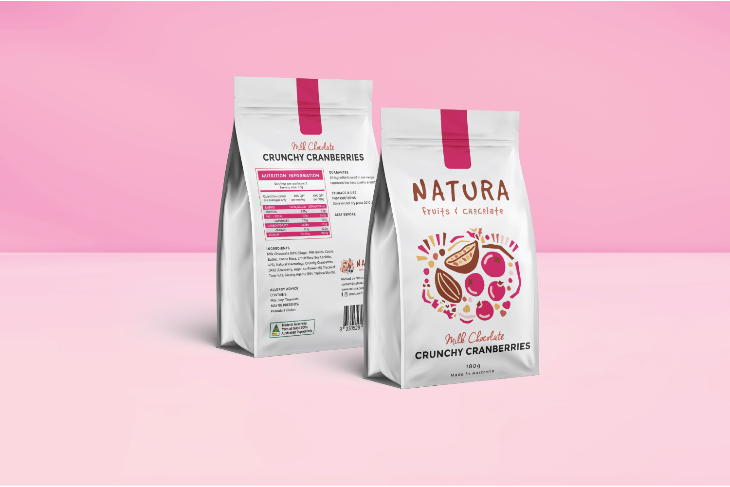
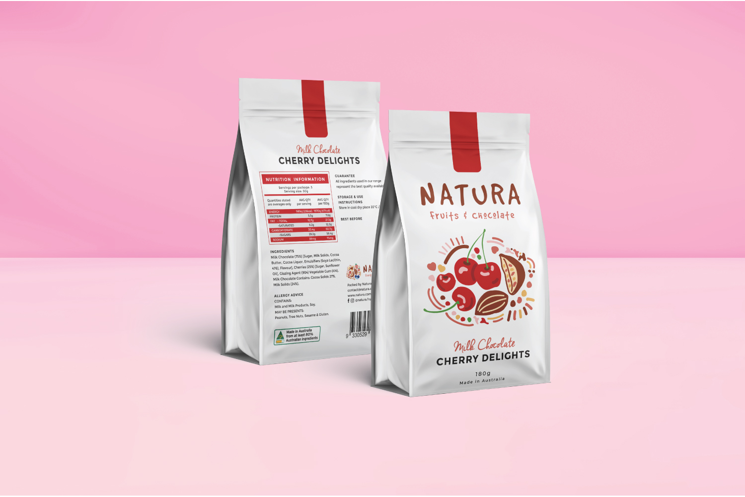
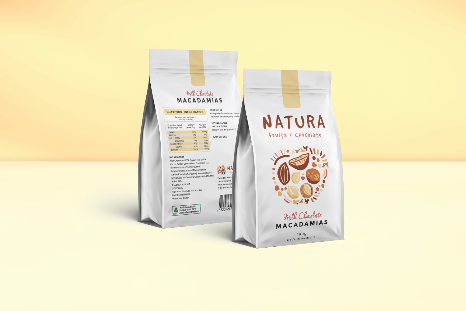
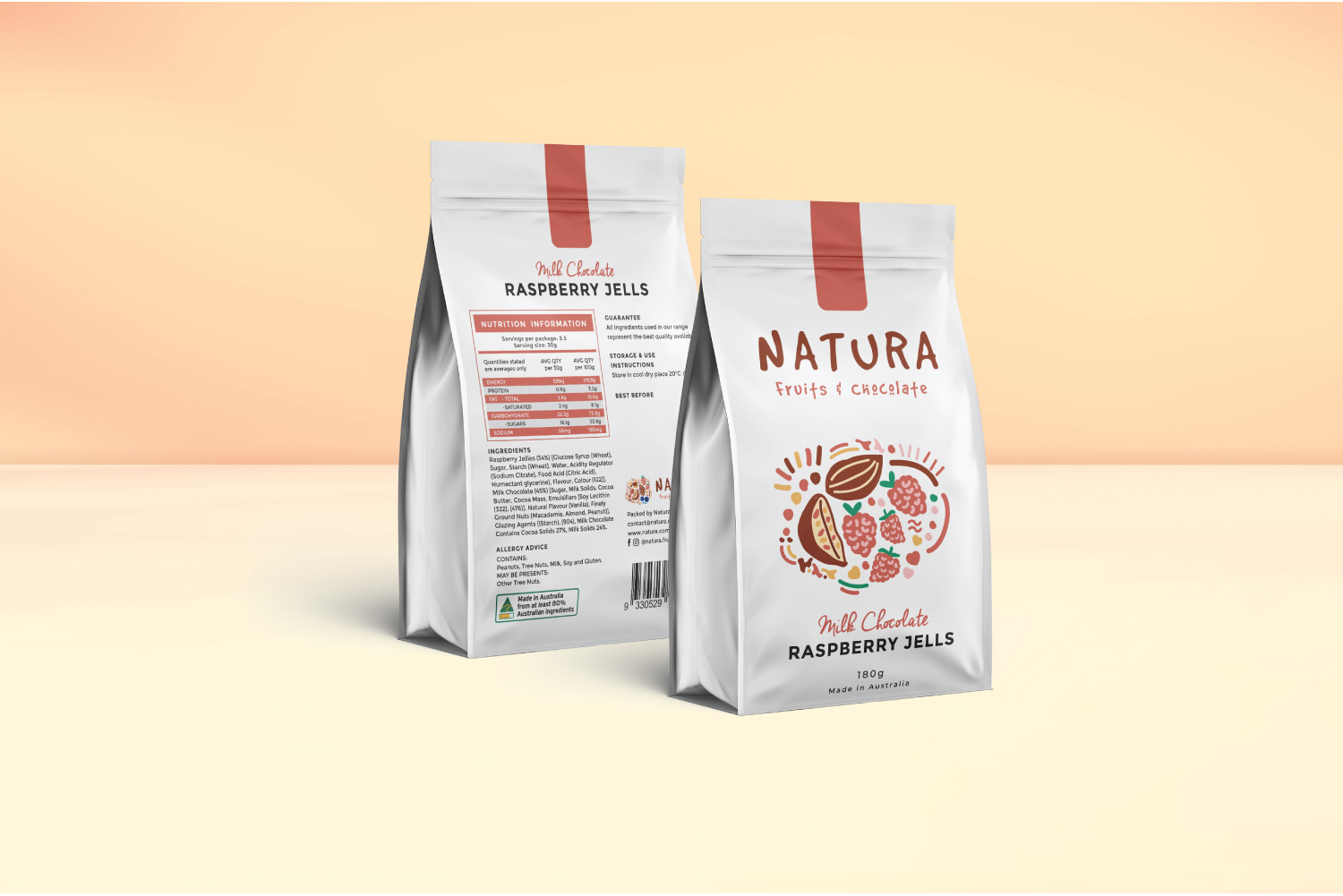
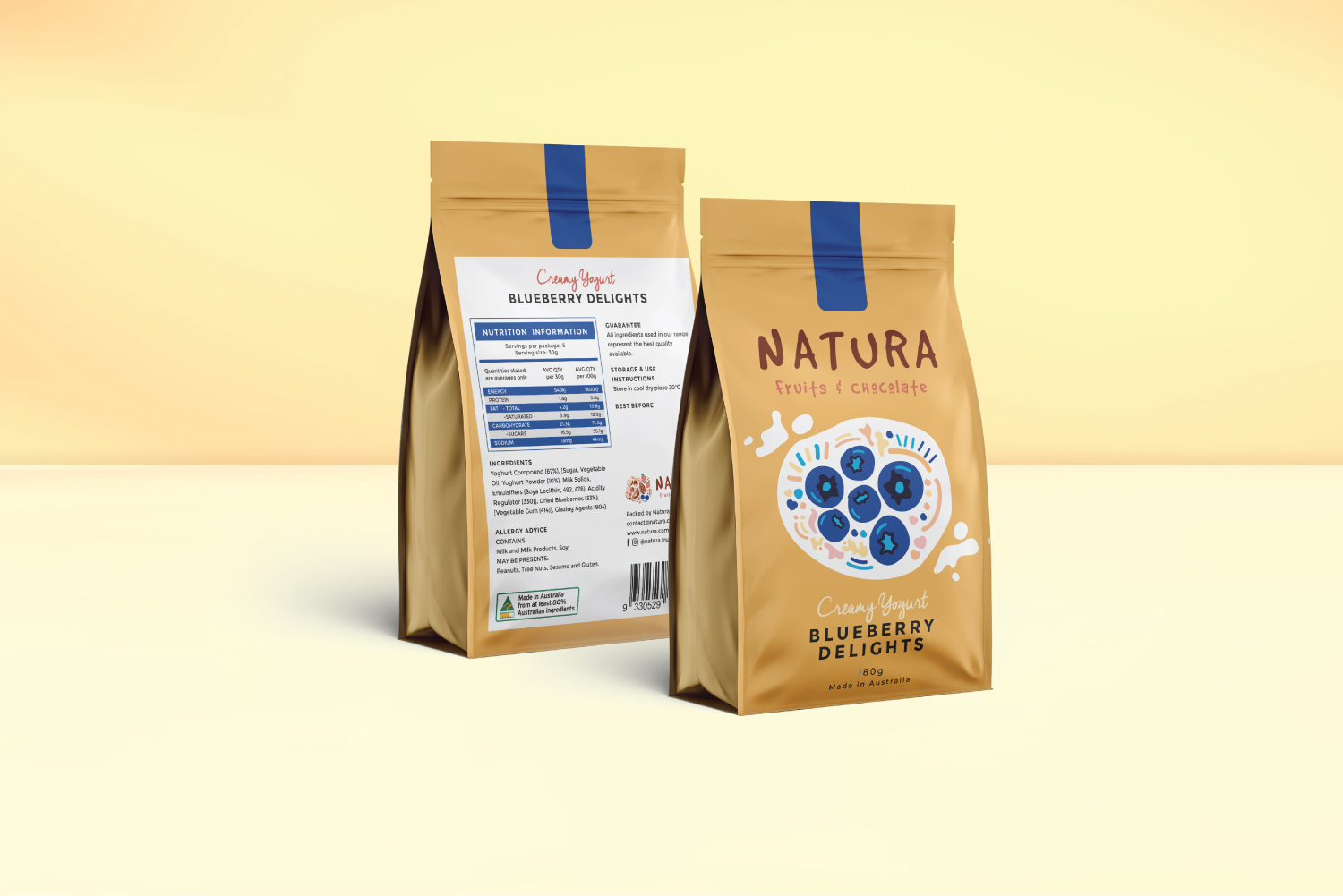
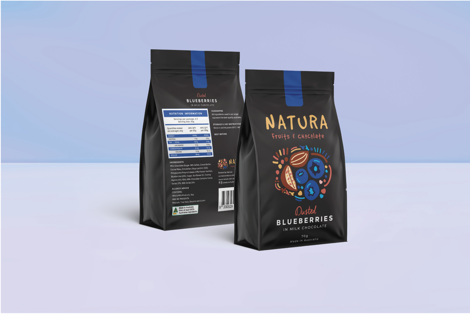
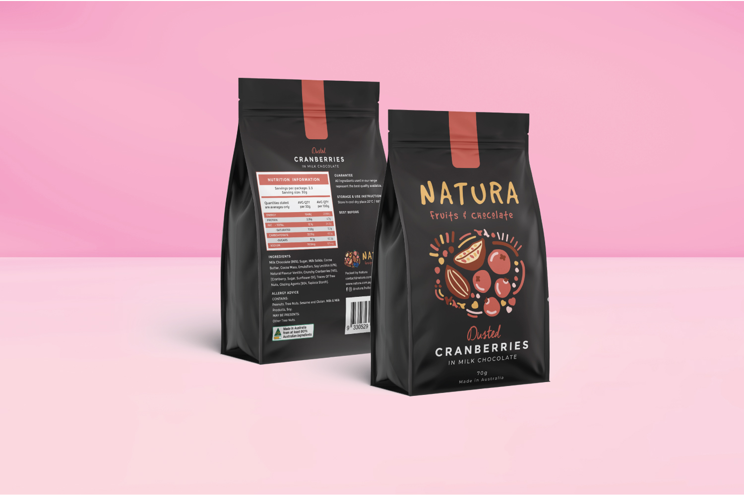
Natura was a rebranding project evolved from the original brand Fruits x Berries. RayL Creative redefined the brand to target families, positioning Natura as a chocolate treat that everyone can enjoy together after a shared meal. The brand emphasises Australian-made quality, warmth, and accessibility. We redesigned the logo using simple shapes, soft colours, and dot elements, paired with hand-drawn fruit illustrations to create a playful yet refined visual language. The project was completed with a full packaging system that brought the brand to life on shelf and in gifting.
Client
Natura Fruits & Chocolate
Project year
2021
Designer
Raymond Lim